Ready to elevate your brand
to new and exciting places?

address

Generala Anrija 11
11000 Belgrade
Serbia

say hello

[email protected]

EAACI
EAACI Speakers Support Programme webpage design – desktop UI showing scientific collaboration content
EAACI website "Interested in Collaborating?" section – call-to-action page with audience backdrop
EAACI digital platform UI design – Speaker and Symposium Criteria content layout
Preserving institutional heritage while modernizing the look and feel through contemporary gradients and strict typographic layouts to anchor a global medical authority in the digital-first era.
EAACI Annual Congress events portal – full-width desktop interface with event navigation tabs
EAACI mobile app and science section UI – dual smartphone screens showing Science and Education pages

The Creative & Technical Challenge

Medical institutions operate on massive scales, requiring complex digital architectures to manage member tools, scientific data libraries, and real-time event portals. The challenge was two-fold. Visually, EAACI needed to move away from fragmented legacy interfaces and establish a cohesive, modern user experience that felt elevated yet accessible. We needed to modernize their entire look and feel while respecting their institutional heritage by preserving the established core logo. Technically, the architecture demanded a secure multi-site configuration capable of handling heavy backend workflows, dynamic API services, and unified member portal systems under intense global traffic surges.

Our Integrated Approach

We executed an end-to-end design and engineering roadmap, building a scalable web component library on the frontend while routing enterprise tool sets through a hardened custom backend.

Visual Identity Modernization

Upgraded the academy's entire look and feel by preserving the historic core logo while modernizing the corporate color palette and incorporating sleek, digital-first gradient elements to deliver a progressive, contemporary aesthetic.

Component-Driven Design System

Conceived and mapped a massive, reusable UI component library within Adobe XD, locking down strict visual grids, responsive layouts, refined palettes, and editorial typography rules to guarantee absolute consistency across all platforms.

Hybrid Full-Stack Architecture

Developed a fluid public-facing frontend layout within WordPress and completely separated the platform's intensive administrative logic by building a bespoke, high-performance Laravel backend to house core portal functions and secure database records.

Portal & API Custom Integration

Programmed a modular user framework running on dynamic API services, incorporating secure multi-tier account handling, Vue.js portal views, and secure payment gateway integrations to handle membership workflows flawlessly.

EAACI History interactive timeline and Science portal – mobile interface design by SYSTEM Studio

The Outcome

The phased launch successfully elevates EAACI’s digital presence to match its global institutional prestige. By combining a striking, modernized frontend layout featuring sophisticated gradient accents with an impenetrable Laravel backend framework, we provided the academy with a robust, enterprise-grade digital stage. The platform gracefully navigates complex administrative operations—from global registration portals to member areas—ensuring an ultra-smooth, responsive user journey. This landmark project highlights SYSTEM Studio’s capacity to design, engineer, and maintain large-scale web applications for major international organizations.

EAACI Contact page with newsletter sign-up section – blue gradient UI design
EAACI Leadership & Organisation page – Executive Committee and HQ Team cards with member portraits
The Village at Landmark
The Village at Landmark – luxury residential interior with warm living room design
The Village at Landmark website – mobile and desktop responsive design mockup
Engineering a pristine, typography-driven digital gatehouse for Century Communities that commands brand presence while establishing a robust infrastructure for early lead capture in the Denver market.
The Village at Landmark website – desktop homepage view
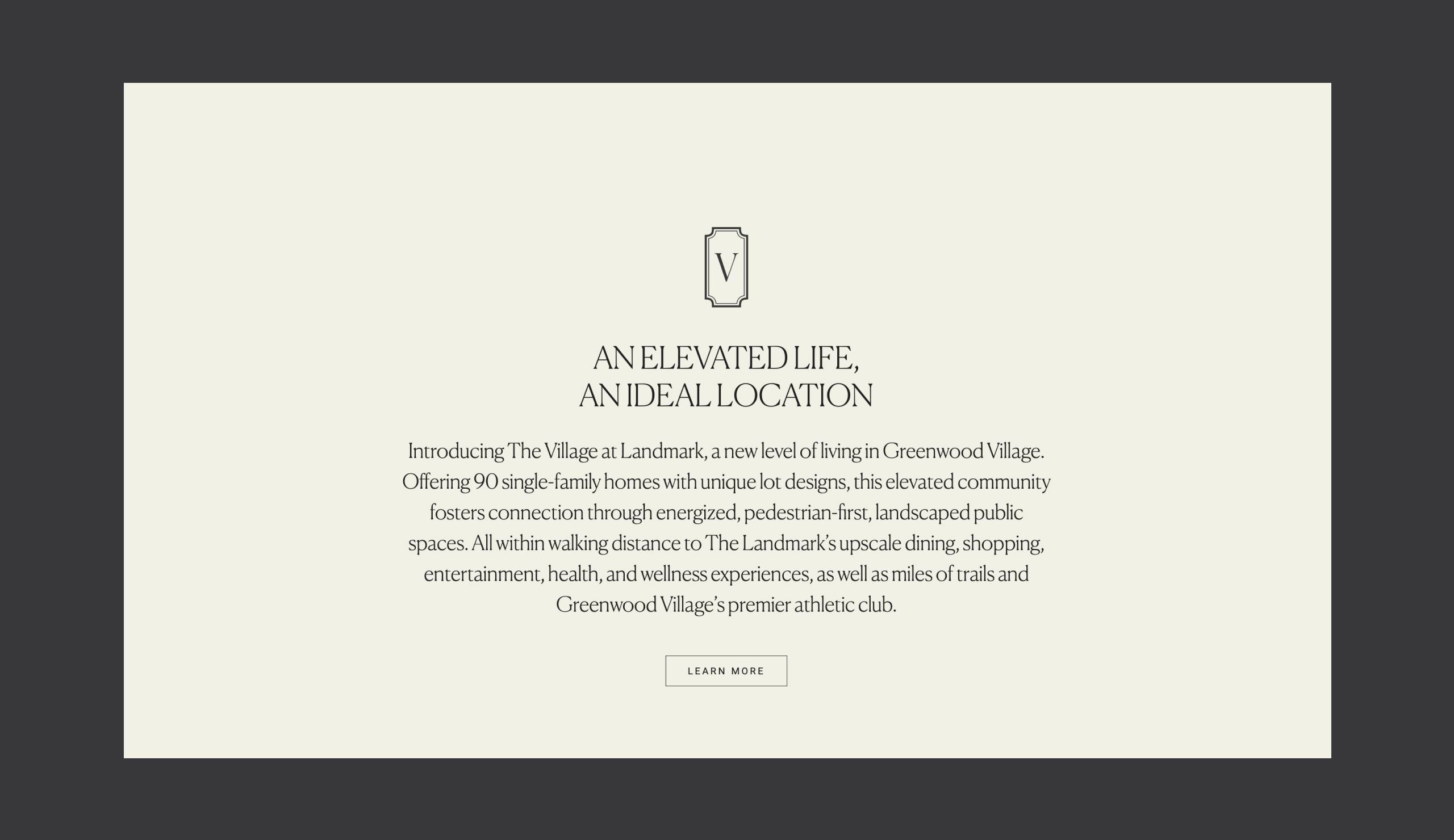
The Village at Landmark – branded website editorial section screenshot

The Technical Challenge

Teaser and registration platforms require an uncompromising visual presentation since a single minimalist interface must do the heavy lifting of a complete multi-page portal. The primary engineering challenge lay in ensuring that high-resolution design renders, ambient brand videos, and fluid layout transitions scale with pixel-perfect margins down to mobile screens without compromising on site speed. Because Century Communities’ core commercial metric relies entirely on lead capturing ahead of the public sales launch, the code infrastructure demanded a highly secure, automated server-side data routing system to protect prospective client submissions while maintaining zero frontend interface lag.

Our Engineering Approach

We engineered a bespoke, high-performance WordPress frontend from the ground up, combining strict visual grid alignment with hardened content data schemas.

Teaser Framework Optimization

Structured a highly optimized, semantic frontend layout designed to load multimedia assets and high-definition architectural imagery instantly, preventing layout shifts across variable global network connections.

Pixel-Perfect Typography Grids

Executed a deliberate editorial typography hierarchy and fine-line layout system that preserves its exact visual proportions, spatial boundaries, and high-end aesthetic across all viewport dimensions.

Hardened Data Routing Integration

Programmed custom, secure data pathways and tokenized capture systems within the backend theme architecture, allowing incoming user inquiries to cleanly register without introducing script bloat.

Scalable Core Code Base

Built a lightweight, custom-coded foundational theme completely stripped of heavy third-party dependencies, giving the client a robust technical launchpad that can be seamlessly expanded into a multi-page portal in future release phases.

The Village at Landmark website – full mobile responsive design view

The Outcome

The finalized platform establishes an immediate visual baseline that reflects the grand scale of Century Communities’ incoming physical Landmark development. By deploying a robust, fast-loading custom WordPress architecture beneath a minimalist frontend facade, we provided the client with an elite, secure tool to dominate early market positioning in Denver. Every interaction feels fluid, intentional, and high-end—visually validating our studio’s capacity to deliver uncompromising technical execution for premium real estate flagships.

Timbers Captiva
Timbers Captiva website design – homepage desktop screenshot
A Rare Return to Captiva – branded editorial image with seashell
Weaving pristine coastal branding and heavy multimedia assets into a fluid, responsive digital flagship for a historic, once-in-a-generation island development.
Timbers Captiva – editorial branded visual for luxury coastal residences

Strategy & Editorial Concept

The creative strategy was anchored in the poetic tension of the island’s rhythm: “Where time moves by tide.” To honor this unhurried pace while fulfilling rigorous commercial sales objectives, we balanced airy, expansive editorial layouts with precise, high-intent user flows. The digital ecosystem is designed to feel less like a traditional real estate brochure and more like a private, light-filled coastal sanctuary, establishing emotional resonance before introducing fractional and whole-ownership opportunities.

Timbers Captiva website – mobile responsive view

The Architecture of the Experience

Contextual Digital Design

We established a visual system defined by crisp spatial geometry, refined typography, and an organic, sun-bleached color palette. The interface mirrors the contemporary coastal architecture of the residences, allowing expansive imagery of the Gulf to dictate the site’s natural pacing.

Bespoke WordPress Development

Built entirely from the ground up, the custom WordPress architecture prioritizes fluid, responsive transitions, pixel-perfect layout integrity, and effortless backend content management for real-time asset updates.

Omni-Channel Asset Suite

To power the project’s multi-tiered launch campaign, we designed and structured a comprehensive production suite of over 10 digital banner sizes. Each asset adapted the campaign's elevated aesthetic into highly compressed, high-performance ad formats without compromising on typographic elegance or premium brand equity.

Results & Impact

Launched seamlessly to the market, the new Timbers Captiva platform successfully synthesizes quiet luxury branding with elite technical execution. The unified ecosystem provides a pristine, high-converting digital showroom that captures the attention of high-net-worth buyers and broker networks alike, establishing a new modern benchmark for luxury coastal property developments.

14 White Tribeca
14 White Tribeca brand identity – square format
14 White Tribeca brand identity – square format, second view
Fusing historic Tribeca industrial aesthetics with print-grade editorial layouts to engineer a seamless, high-performance brand flagship for an ultra-luxury residential icon.
14 White Tribeca fact sheet design
14 White Tribeca website – square format, second view

The Creative & Technical Challenge

Boutique real estate in historic Manhattan requires an elite visual standard that instantly communicates exclusivity and architectural craft to high-net-worth buyers. The design challenge lay in celebrating the building’s distinct ironwork and cast-iron architecture through a modern, minimalist digital framework. From a product engineering standpoint, the hurdle was translating this print-grade, gallery-style layout system onto the web without losing visual alignment. High-resolution cinematic background videos, large-scale structural renderings, and interactive floor plans had to load with instantaneous speeds, remaining flawless and pixel-perfect across all mobile devices.

14 White Tribeca mobile website design with texture

Our Integrated Approach

We executed a completely unified, full-service strategy, ensuring that the brand’s physical ethos transitioned seamlessly into a modern digital platform.

Boutique Brand Strategy & Identity

Conceived a tailored visual identity system rooted in the industrial, avant-garde heritage of Tribeca, setting a sophisticated typography matrix and an understated, high-contrast color palette.

Editorial UI/UX Web Design

Formulated a spacious, gallery-inspired interface design featuring dramatic whitespace, bold typographic headers, and clean layout grids that allow full-bleed property renderings to dominate the browser view.

Custom WordPress Code Engineering

Built a high-performance WordPress frontend entirely from scratch using clean code architecture, ensuring precise spatial margins and asset container lines remain perfectly balanced across any screen dimension.

Optimized Asset Pipeline Delivery

Programmed customized background media compression loops and lazy-loading scripts, enabling raw cinematic imagery and residential layouts to stream immediately without layout drift or latency.

The Outcome

The successful launch of 14 White Tribeca delivers an immersive, digital-first experience that perfectly mirrors the luxury of the physical structure. By owning the entire lifecycle—from the initial brand strategy and typography rules to the custom frontend framework—SYSTEM Studio built an uncompromising marketing portal that functions flawlessly under intense broker and investor traffic. The project stands as a definitive showcase of our studio’s capacity to deliver end-to-end creative direction, editorial design precision, and elite full-stack code execution for the luxury sector.

Souk Studio
Translating elite, print-grade graphic design systems into high-performance digital environments through strict layout discipline and custom, seamless API engineering.

The Technical & Design Challenge

Translating an uncompromising, highly calculated graphic design language like Order’s onto the live web requires extreme layout discipline. Minimalist, type-driven designs break instantly if spatial margins, fine lines, or responsive alignment drift by even a single pixel across screen dimensions. The core engineering hurdle lay in fusing this strict editorial look with the heavy, dynamic data streams of the Momence platform. We needed to ensure that live class timetables, expert instructor listings, and client booking modules synchronized instantaneously across mobile and desktop devices without introducing clunky, generic widget styling that would ruin the pristine layout.

Our Engineering & Design Approach

We deployed an integrated, full-stack approach that honors elite graphic design systems while building highly performant third-party API architectures.

Digital Translation of Brand Identity

Adapted Order's structural typography matrices, strict column grids, and bold, high-contrast color palettes into an editorial-grade, responsive digital user interface (UI/UX).

Bespoke Momence API Integration

Bypassed generic, performance-heavy iframe embeds to build a custom, headless implementation of the Momence API, enabling dynamic, lightning-fast schedule loading and frictionless booking.

Custom WordPress Core Architecture

Engineered a lightweight, robust custom WordPress frontend entirely from scratch, utilizing clean code to lock down precise spacing margins and asset container lines across any viewport.

Continuous Multi-Year Optimization

Structured a long-term, proactive site maintenance framework over the past four years to deploy continuous speed optimizations, security patches, and localized class feature enhancements as the studio expands.

The Outcome

The resulting platform transformed Souk Studio’s web presence into a masterful digital reflection of its physical sanctuary. By combining deep respect for world-class print design with sophisticated full-stack engineering, SYSTEM Studio created a striking, high-velocity booking hub that functions flawlessly under high concurrent member check-ins. The project stands as a definitive blueprint of how we act as the premier digital extension for elite design agencies—perfectly translating physical branding systems into secure, permanent web software.

Martien Mulder
Martien Mulder website – homepage lightbox view showing The City Beautiful book cover with architectural and textile photography

The Design & UX Challenge

Designing for world-class visual artists demands absolute restraint. The primary challenge was to construct a digital framework where the user interface entirely recedes into the background. Every layout needed to accommodate wildly varying image aspect ratios—from sweeping horizontal landscapes to vertical portrait editorials—without breaking the structural rhythm. The typography and grid systems had to feel deliberate, elegant, and quiet, ensuring the platform never competes with the photography for the viewer’s attention.

Martien Mulder website – Selected Work gallery grid displaying editorial photo series collections including interiors and fine art photography

Our Integrated Approach

By managing both the design and frontend execution, we engineered a flawless relationship between the visual layouts and the interactive experience.

Minimalist Art Direction

Implemented an expansive, open-grid system utilizing generous white space and fine editorial borders. We crafted subtle, non-intrusive navigation elements that keep the focus entirely on visual storytelling.

Asymmetric Grid Engineering

Developed a highly flexible fluid masonry layout that effortlessly balances diverse photo sets, print spreads, and book mockups into a cohesive, rhythmic flow across both mobile and desktop screens.

Fluid Transition Mechanics

Built lightweight animation loops and smooth page load behaviors to preserve a calm, high-end browsing experience that mirrors the slow, intentional pace of leafing through a premium physical photography book.

Martien Mulder website – full-screen lightbox view featuring an ethereal portrait of a woman with flowing hair in soft light
Martien Mulder website – photo series detail page showing editorial fashion portrait in minimalist architectural setting with masonry layout

The Outcome

The resulting digital flagship acts as a timeless, editorial extension of Martien Mulder’s artistic voice. By fusing minimalist print-inspired layouts with seamless responsive development, we provided a premium, scalable environment that showcases her commercial archives and personal fine art collections with the prestige they deserve.

"Translating the tactile, intimate feeling of a physical fine-art monograph into a seamless, fluid digital exhibition."
Martien Mulder website – mobile view of Stories section showing editorial photo thumbnails with series titles and image counts
Clark Sabbat
Clark Sabbat fashion collection – three editorial lookbook shots featuring sculptural black and white garments with minimalist styling
Clark Sabbat website – desktop product page for Satomi Top with model editorial shot and product carousel on dark background

The Design & Commerce Challenge

High-end fashion retail requires a precise balance between striking editorial imagery and a frictionless user experience. The primary challenge was to design a platform where heavy lookbook photography, editorial look variations, and detailed product grids could coexist without cluttering the screen. Every visual element—from individual thumbnail margins to multi-column mobile grids—needed a strict, sophisticated spatial hierarchy, ensuring that browsing through a seasonal collection felt as premium as attending an intimate runway presentation.

Clark Sabbat website – full-screen homepage hero featuring a close-up editorial portrait of a model in a structured grey turtleneck garment

Our Integrated Approach

By executing both the aesthetic vision and the technical frontend codebase, we established a seamless relationship between brand storytelling and e-commerce utility.

Editorial D2C Art Direction

Developed a minimalist, high-contrast dark and light mode interface utilizing a refined typographic system, fine lines, and generous whitespace to allow the textures and shapes of the garments to take center stage.

Bespoke Shopify Grid Architecture

Engineered a flexible, asymmetric collection layout that allows editorial portrait spreads and product variations to sit harmoniously alongside a clean, responsive product filtration system.

Fluid Responsive Engineering

Programmed the entire theme from scratch to ensure the multi-image product grids, hover states, and slide-out menus adjust seamlessly down to mobile devices, providing an elegant shopping experience on any screen.

Clark Sabbat website – three mobile screens showing Lookbook and Archive navigation, Lookbook editorial grid and The Yoko Dress product detail page
Clark Sabbat brand – black and white behind the scenes photo of a model being photographed during a fashion editorial shoot

The Outcome

The resulting digital flagship functions as a timeless, editorial extension of the Clark Sabbat brand identity. By uniting architectural layouts with a streamlined, responsive Shopify checkout funnel, we delivered a premier digital blueprint for how independent luxury fashion should look, feel, and transact online.

Clark Sabbat website – two desktop views showing Satomi Top product detail page and Trending Now shop section with Shino Dress, Sayumi Dress and Emiko Jacket
Clark Sabbat fashion – editorial campaign photograph of a female model wearing a white asymmetric dress in a minimalist studio setting
Clark Sabbat website – mobile screen showing Lookbook editorial grid with fashion photography series and collection navigation
Translating structural silhouettes and minimalist elegance into a pixel-perfect digital flagship built for the modern luxury consumer.
Clark Sabbat website – mobile screen showing Design section homepage with full-bleed editorial fashion photography