Ready to elevate your brand
to new and exciting places?

address

Generala Anrija 11
11000 Belgrade
Serbia

say hello

[email protected]

Match Group
Match Group website – homepage featuring brand portfolio with Tinder, Hinge, Match.com and other dating apps
Match Group website – About page with hero section showing couple near waterfront and tagline Global Presence Revolutionary Technology Deeper Connections
Bypassing standard template frameworks to engineer an impenetrable, custom Laravel architecture built specifically to meet the high-stakes security mandates of a global technology giant.
Match Group website – Trust and Safety page with mobile app screenshot showing safety features

The Technical Challenge

For an institutional technology entity of this scale, data protection and code hardening are paramount. Standard open-source templates leave far too many entry points for potential vulnerabilities, making traditional CMS platforms completely unviable for Match Group’s corporate framework. The engineering challenge lay in building a custom web architecture capable of handling intense concurrent institutional traffic, processing financial data records, and hosting corporate investor updates while ensuring that the underlying server environment remained completely impenetrable to security exploits.

Match Group website – mobile view of homepage with Empowering Connections Through Technology tagline

Our Engineering Approach

We engineered a bespoke full-stack web application leveraging the advanced security architecture of the Laravel framework, completely optimizing the codebase for speed and server-side data isolation.

Custom Framework Hardening

Utilized Laravel's robust Model-View-Controller (MVC) architecture to build completely isolated, custom application logic, utilizing tokenized forms, custom data encryption layers, and built-in protection against SQL injection vulnerabilities.

Pixel-Perfect Typography Grids

Translated a highly precise, minimal corporate layout system across all device dimensions, maintaining sharp spatial alignment and sophisticated grid transitions without relying on performance-heavy frontend frameworks.

Optimized Investor Data Feeds

Built lightweight, secure database handling architectures that allow corporate filings, media rooms, and stock market assets to stream quickly and fluidly to the frontend without introducing data latency.

Server-Side Security Tuning

Hardened the custom PHP application environment with secure access control levels, automated security header injections, and continuous code audits to meet strict institutional tech compliance guidelines.

Match Group website – desktop view showing About section with Everyone Belongs diversity statement and Match Group logo

The Outcome

The resulting Laravel application provides Match Group with a secure, high-performance corporate flagship built to withstand elite operational stress. By prioritizing security through custom PHP framework engineering rather than shortcut template platforms, we delivered an enterprise architecture that operates flawlessly under heavy global concurrent spikes. The project highlights SYSTEM Studio’s capability to operate as a high-tier engineering partner, providing institutional-grade security structures for the world’s largest public technology corporations.

Eager Drinks
Eager Drinks website – product page for Tomato Juice with bold typography and fresh tomatoes photography
Eager Drinks website – Fresh From the Cupboard section showing juice stacking lifestyle and Oranges product close-up
Engineering high-velocity Shopify 2.0 architectures designed to handle rich D2C brand experiences while maintaining peak transactional performance.
Eager Drinks website – desktop homepage featuring Cranberry Pomegranate Pineapple and Grapefruit juice product range
Eager Drinks website – desktop homepage with orange juice hero shot and bold brand headline If It Tasted Any Better It'd Be Unnatural

The Technical Challenge

Fast-moving consumer goods (FMCG) brands demand an ultra-efficient e-commerce funnel with zero barriers to purchase. The primary engineering hurdle lay in taking a bold, vibrant design and translating it into a highly performant transactional experience that handles large traffic surges cleanly. The backend taxonomy needed to elegantly manage diverse product variants, multi-pack configurations, and bulk logistics options. At the same time, the frontend required strict code hygiene to keep image-heavy asset blocks loading instantaneously on mobile devices.

Eager Drinks website – desktop homepage with Normcore Cranberry Juice product showcase on light blue background

Our Engineering Approach

We utilized the modular architecture of Shopify 2.0 to deliver an agile frontend layout built for swift browsing and long-term administrative ease.

Bespoke Theme Architecture

Engineered tailored Shopify sections and reusable blocks that allow editorial branding, vibrant asset grids, and promotional mechanics to sit side-by-side cleanly without bloating the core codebase.

Frictionless Cart Integration

Programmed optimized slide-out cart drawers and quick-add product functionalities to reduce steps in the checkout funnel and directly maximize mobile conversion metrics.

Core Web Vitals Optimization

Implemented strict asset compression, smart script lazy-loading, and minimized liquid overhead to guarantee lightning-fast page loading speeds across all device viewports.

Continuous Feature Upgrades

Maintain a proactive, ongoing engineering partnership to regularly deploy system performance audits, checkout optimization upgrades, and custom feature enhancements as the brand's digital requirements evolve.

Eager Drinks website – mobile product detail page for Pink Grapefruit Juice multipack with yellow brand packaging

The Outcome

The resulting platform gives Eager Drinks a robust, high-performance retail engine built to convert. By locking down a stable, highly optimized Shopify 2.0 codebase, we ensured their visual identity runs on an enterprise-grade foundation capable of facilitating continuous sales loops. Our ongoing retainer for technical upgrades and structural maintenance guarantees that their storefront remains lightning-fast, dependable, and highly secure—matching the energetic, forward-moving trajectory of the brand itself.

Souk Studio
Translating elite, print-grade graphic design systems into high-performance digital environments through strict layout discipline and custom, seamless API engineering.

The Technical & Design Challenge

Translating an uncompromising, highly calculated graphic design language like Order’s onto the live web requires extreme layout discipline. Minimalist, type-driven designs break instantly if spatial margins, fine lines, or responsive alignment drift by even a single pixel across screen dimensions. The core engineering hurdle lay in fusing this strict editorial look with the heavy, dynamic data streams of the Momence platform. We needed to ensure that live class timetables, expert instructor listings, and client booking modules synchronized instantaneously across mobile and desktop devices without introducing clunky, generic widget styling that would ruin the pristine layout.

Our Engineering & Design Approach

We deployed an integrated, full-stack approach that honors elite graphic design systems while building highly performant third-party API architectures.

Digital Translation of Brand Identity

Adapted Order's structural typography matrices, strict column grids, and bold, high-contrast color palettes into an editorial-grade, responsive digital user interface (UI/UX).

Bespoke Momence API Integration

Bypassed generic, performance-heavy iframe embeds to build a custom, headless implementation of the Momence API, enabling dynamic, lightning-fast schedule loading and frictionless booking.

Custom WordPress Core Architecture

Engineered a lightweight, robust custom WordPress frontend entirely from scratch, utilizing clean code to lock down precise spacing margins and asset container lines across any viewport.

Continuous Multi-Year Optimization

Structured a long-term, proactive site maintenance framework over the past four years to deploy continuous speed optimizations, security patches, and localized class feature enhancements as the studio expands.

The Outcome

The resulting platform transformed Souk Studio’s web presence into a masterful digital reflection of its physical sanctuary. By combining deep respect for world-class print design with sophisticated full-stack engineering, SYSTEM Studio created a striking, high-velocity booking hub that functions flawlessly under high concurrent member check-ins. The project stands as a definitive blueprint of how we act as the premier digital extension for elite design agencies—perfectly translating physical branding systems into secure, permanent web software.

Martien Mulder
Martien Mulder website – homepage lightbox view showing The City Beautiful book cover with architectural and textile photography

The Design & UX Challenge

Designing for world-class visual artists demands absolute restraint. The primary challenge was to construct a digital framework where the user interface entirely recedes into the background. Every layout needed to accommodate wildly varying image aspect ratios—from sweeping horizontal landscapes to vertical portrait editorials—without breaking the structural rhythm. The typography and grid systems had to feel deliberate, elegant, and quiet, ensuring the platform never competes with the photography for the viewer’s attention.

Martien Mulder website – Selected Work gallery grid displaying editorial photo series collections including interiors and fine art photography

Our Integrated Approach

By managing both the design and frontend execution, we engineered a flawless relationship between the visual layouts and the interactive experience.

Minimalist Art Direction

Implemented an expansive, open-grid system utilizing generous white space and fine editorial borders. We crafted subtle, non-intrusive navigation elements that keep the focus entirely on visual storytelling.

Asymmetric Grid Engineering

Developed a highly flexible fluid masonry layout that effortlessly balances diverse photo sets, print spreads, and book mockups into a cohesive, rhythmic flow across both mobile and desktop screens.

Fluid Transition Mechanics

Built lightweight animation loops and smooth page load behaviors to preserve a calm, high-end browsing experience that mirrors the slow, intentional pace of leafing through a premium physical photography book.

Martien Mulder website – full-screen lightbox view featuring an ethereal portrait of a woman with flowing hair in soft light
Martien Mulder website – photo series detail page showing editorial fashion portrait in minimalist architectural setting with masonry layout

The Outcome

The resulting digital flagship acts as a timeless, editorial extension of Martien Mulder’s artistic voice. By fusing minimalist print-inspired layouts with seamless responsive development, we provided a premium, scalable environment that showcases her commercial archives and personal fine art collections with the prestige they deserve.

"Translating the tactile, intimate feeling of a physical fine-art monograph into a seamless, fluid digital exhibition."
Martien Mulder website – mobile view of Stories section showing editorial photo thumbnails with series titles and image counts
LA Golf Shafts
LA Golf Shafts website – homepage hero section featuring a professional golfer mid-swing with brand tagline and Learn More call to action
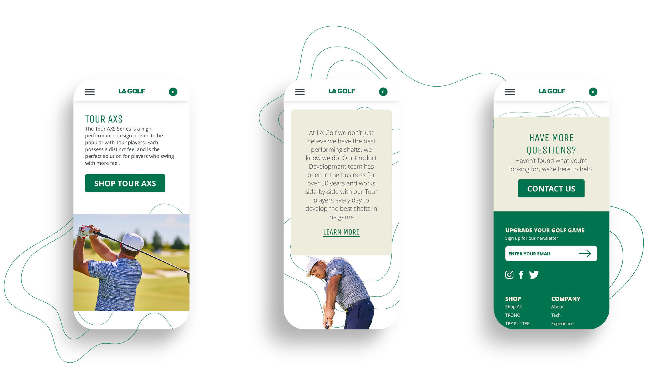
LA Golf Shafts website – mobile homepage screen showing Upgrade Your Game hero section with professional golfer photo

The Technical Challenge

High-performance golf equipment requires an immense amount of education—featuring data sheets, professional endorsement content, and precise product variants. The technical challenge lay in building an interface that handles complex product grids and dense interactive media without creating performance bottlenecks. Additionally, we needed to implement custom styling and unique responsive contours (such as the signature topographical line vectors winding behind mobile devices) while strictly adhering to Shopify 2.0’s core architecture for long-term scalability.

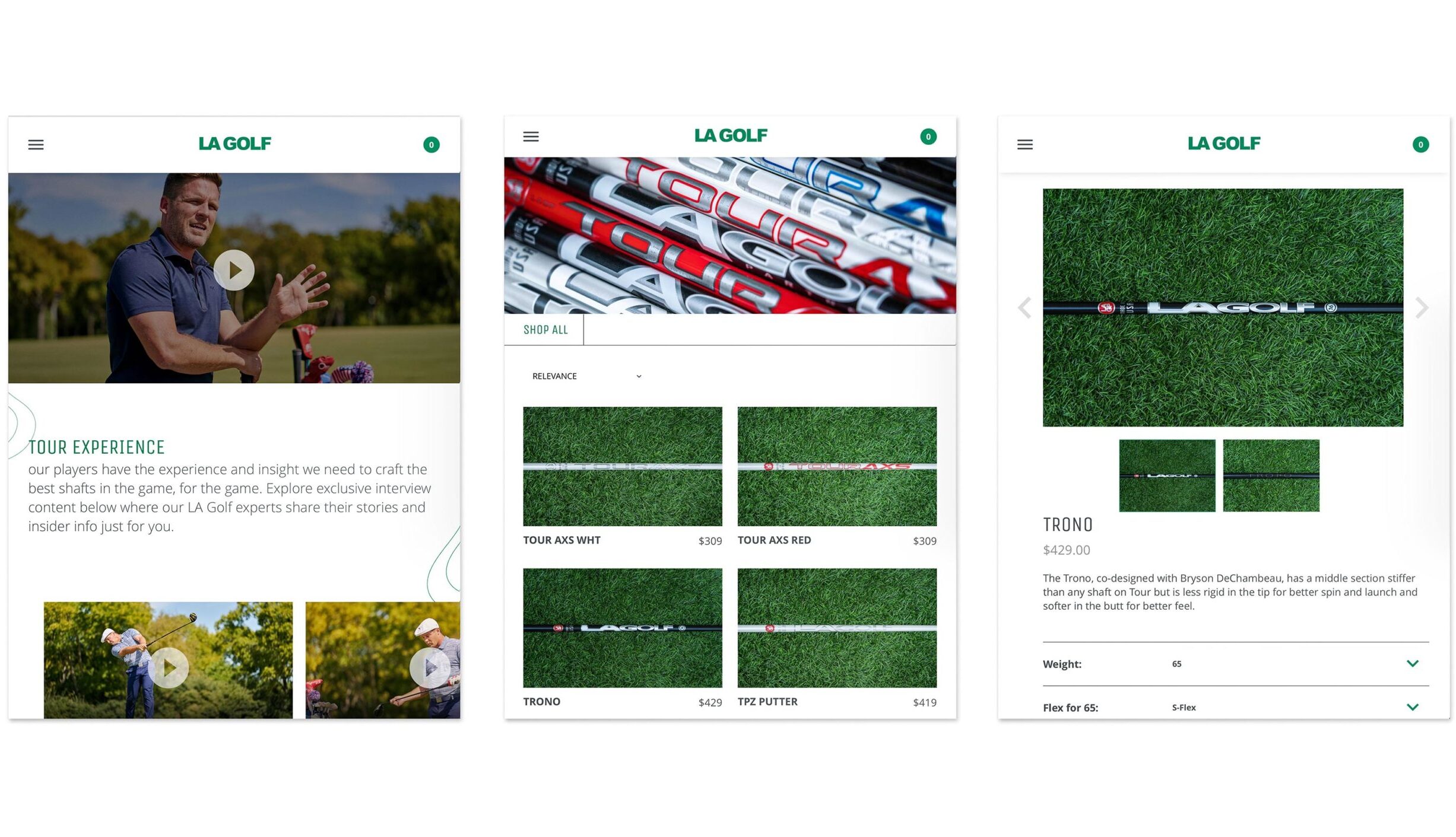
LA Golf Shafts website – desktop product listing page featuring TROND and TPZ Putter shaft models with technical specs and Shop buttons

Our Engineering Approach

We utilized the modern architecture of Shopify 2.0 to give the client modular flexibility while developing tailored frontend components.

Bespoke Theme Architecture: Engineered custom Shopify sections and blocks that allowed text, interactive video modules, and grid-based collections to sit side-by-side seamlessly.

Advanced Visual Layouts: Built an asymmetric, modern interface featuring custom contour line overlays and strict multi-column product tables that remain fully fluid and readable from large screens down to mobile devices.

Responsive Product Filtering: Developed a lightning-fast, intuitive product grid system that allows users to seamlessly parse high-value items based on rigid technical metrics without page refreshes.

LA Golf Shafts – professional golfer executing a full swing on a golf course, showcasing tour-level athletic performance

The Outcome

The resulting platform transformed LA Golf Shafts’ digital storefront into a premium, high-converting brand archive. By merging complex layouts and deep brand storytelling with a frictionless, responsive checkout funnel, we provided the ultimate proof-of-concept for how custom luxury retail should function and feel on modern e-commerce infrastructure.

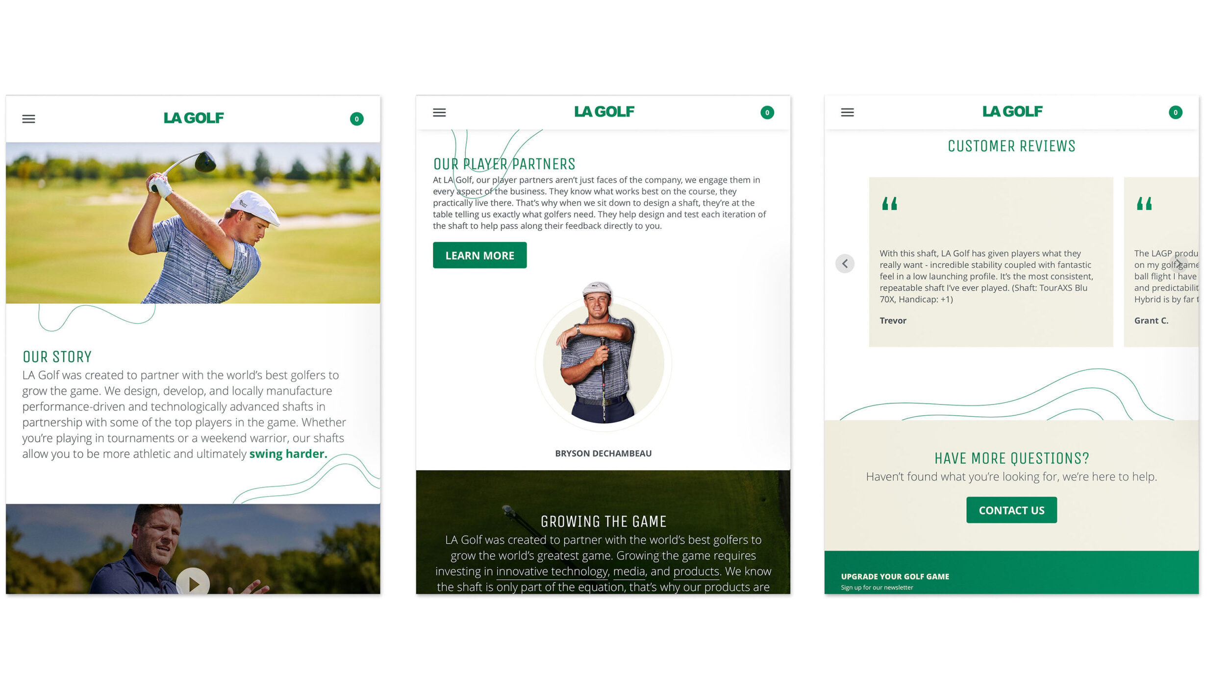
LA Golf Shafts website – three desktop screens showing homepage Our Story section, Our Player Partners page featuring Bryson DeChambeau, and Customer Reviews page
Precision meets personality. Engineering premium, tour-tested equipment that redefines how the modern game feels.
LA Golf Shafts website – three desktop screens showing homepage hero, Player Partners section with Growing The Game content, and Customer Reviews with FAQ section
LA Golf Shafts website – mobile screens showing homepage story section, Player Partners page and Customer Reviews with contact CTA
JMF Properties
JMF Properties website – residential property listings page showing Clarus Berkeley Heights, The American and Estling Village projects in New Jersey

The Technical Challenge

Real estate platforms must serve multiple distinct user flows: institutional investors seeking corporate track records, commercial tenants evaluating retail space, and residential prospects searching for active listings. The technical challenge lay in building a multi-site architecture that cleanly splits corporate operations from dynamic consumer leasing environments. The frontend required a highly grid-aligned, fluid UI to display expansive aerial videography and property galleries, while the backend demanded an intuitive taxonomy so their internal team could seamlessly scale property statuses without alignment drift.

JMF Properties website – individual property detail page for Clarus Maplewood commercial and residential development in Maplewood NJ

Our Engineering Approach

We engineered a highly optimized, custom WordPress infrastructure focused on multi-site logic, structural data fields, and long-term codebase maintenance.

Multi-Site Architecture Development

Built a unified, scalable development ecosystem that powers both the main brand platform and the dedicated rental engine, allowing for shared backend logic and streamlined administrative control.

Custom Property Taxonomies

Programmed a tailored system of custom fields and data filters, enabling seamless filtering across active, upcoming, and completed commercial and residential real estate assets.

Lifecycle Technical Support

Implemented a continuous maintenance framework, optimization scripts, and database infrastructure support to keep both media-heavy platforms performing at peak efficiency long after their public launch.

JMF Properties website – commercial properties portfolio page featuring Clarus Maplewood, Eagle Rock Commons, Warren Village, Waterview Marketplace and Cedar Village
JMF Properties website – homepage homepage showing Estling Village residential property and 2 Million Residents milestone stat

The Outcome

The resulting digital infrastructure transformed JMF Properties’ online footprint into a sophisticated, unified asset management hub. By establishing a robust code architecture capable of elegantly organizing millions of dollars in real estate assets, we provided the firm with a scalable foundation for future growth. Our ongoing engineering maintenance guarantees that their platforms remain stable, fast, and responsive across all viewports—matching the premium, institutional standards of the physical properties they develop.

JMF Properties website – mobile view of Projects page with Commercial, Residential and Under Development category filters
Engineering a dual-platform real estate ecosystem built to organize complex portfolios and power high-volume property leasing seamlessly.
JMF Properties website – three-panel responsive view showing homepage hero, projects listing and individual property detail page
Clark Sabbat
Clark Sabbat fashion collection – three editorial lookbook shots featuring sculptural black and white garments with minimalist styling
Clark Sabbat website – desktop product page for Satomi Top with model editorial shot and product carousel on dark background

The Design & Commerce Challenge

High-end fashion retail requires a precise balance between striking editorial imagery and a frictionless user experience. The primary challenge was to design a platform where heavy lookbook photography, editorial look variations, and detailed product grids could coexist without cluttering the screen. Every visual element—from individual thumbnail margins to multi-column mobile grids—needed a strict, sophisticated spatial hierarchy, ensuring that browsing through a seasonal collection felt as premium as attending an intimate runway presentation.

Clark Sabbat website – full-screen homepage hero featuring a close-up editorial portrait of a model in a structured grey turtleneck garment

Our Integrated Approach

By executing both the aesthetic vision and the technical frontend codebase, we established a seamless relationship between brand storytelling and e-commerce utility.

Editorial D2C Art Direction

Developed a minimalist, high-contrast dark and light mode interface utilizing a refined typographic system, fine lines, and generous whitespace to allow the textures and shapes of the garments to take center stage.

Bespoke Shopify Grid Architecture

Engineered a flexible, asymmetric collection layout that allows editorial portrait spreads and product variations to sit harmoniously alongside a clean, responsive product filtration system.

Fluid Responsive Engineering

Programmed the entire theme from scratch to ensure the multi-image product grids, hover states, and slide-out menus adjust seamlessly down to mobile devices, providing an elegant shopping experience on any screen.

Clark Sabbat website – three mobile screens showing Lookbook and Archive navigation, Lookbook editorial grid and The Yoko Dress product detail page
Clark Sabbat brand – black and white behind the scenes photo of a model being photographed during a fashion editorial shoot

The Outcome

The resulting digital flagship functions as a timeless, editorial extension of the Clark Sabbat brand identity. By uniting architectural layouts with a streamlined, responsive Shopify checkout funnel, we delivered a premier digital blueprint for how independent luxury fashion should look, feel, and transact online.

Clark Sabbat website – two desktop views showing Satomi Top product detail page and Trending Now shop section with Shino Dress, Sayumi Dress and Emiko Jacket
Clark Sabbat fashion – editorial campaign photograph of a female model wearing a white asymmetric dress in a minimalist studio setting
Clark Sabbat website – mobile screen showing Lookbook editorial grid with fashion photography series and collection navigation
Translating structural silhouettes and minimalist elegance into a pixel-perfect digital flagship built for the modern luxury consumer.
Clark Sabbat website – mobile screen showing Design section homepage with full-bleed editorial fashion photography
The Mansour Group
The Mansour Group website – property listings page with grid and map view showing Pediatrics Plus commercial real estate listings in Arkansas with price and cap rate details
The Mansour Group website – two desktop views showing mobile-friendly Find Properties quick search panel and Coast to Coast Presence interactive map of US property locations
Re-engineering legacy corporate codebases into custom Laravel frameworks to optimize global traffic performance while reducing monthly server overhead by over 90%.
The Mansour Group website – two mobile screens showing property search with Google Maps integration and a commercial real estate listing detail page with tenant information
The Mansour Group website – desktop listings page with Marcus and Millichap branding showing property grid, map view and advanced search filters for price range, cap rate and industries

The Technical & Operational Challenge

When TMG initially engaged our studio, their legacy web infrastructure was severely unoptimized, generating massive server maintenance bills running at over $3,000 per month. The underlying system suffered from bloated database configurations, inefficient script execution loops, and poor resource allocation that required excessive cloud computing power just to maintain baseline stability. The engineering challenge lay in completely rewriting the platform from the ground up without disrupting current corporate operations, cleaning the database queries, and mapping out a streamlined server infrastructure capable of handling global traffic at a fraction of the cost.

The Mansour Group website – mobile Find Properties search page with quick search, price range, cap rate and industries filters alongside a Coast to Coast Presence US map view

Our Engineering Approach

We deployed a rigorous optimization strategy, combining the security and clean architecture of the Laravel framework with a modernized, lean cloud server topology.

Bespoke Laravel Re-Engineering

Migrated the entire corporate platform away from legacy codebases into a clean, custom Laravel MVC structure, maximizing data isolation and sharpening core backend script execution speeds.

Radical Cloud Server Optimization

Audit-mapped and stripped down their bloated hosting setup, implementing high-efficiency caching, load balancing rules, and modern server configurations to plummet monthly infrastructure costs from $3,000 to under $250.

Advanced Database Query Profiling

Restructured the corporate database architecture and refined data-fetching pathways, ensuring heavy asset libraries and corporate reports stream fluidly to the frontend without dragging down server memory.

Long-Term Framework Maintenance

Established a continuous, proactive code maintenance protocol to deploy regular security patches, performance audits, and seamless functional iterations across TMG's multi-project digital ecosystem.

The Mansour Group website – desktop property listings view showing Pediatrics Plus NNN lease commercial properties with aerial photography and lease details in grid layout

The Outcome

The resulting Laravel application provides The Mansour Group with an incredibly stable, high-performance corporate hub that runs at peak efficiency. By systematically eliminating infrastructure bloat, we slashed their server overhead by over 90% while actually increasing page responsiveness and technical security boundaries. This multi-year engagement stands as a premier example of how SYSTEM Studio goes beyond beautiful frontends—delivering enterprise-grade, full-stack engineering that directly improves our clients’ operational bottom lines.

Disruptive Acquisition Corporation
Disruptive Acquisition Corporation website – hero section with bold white "DISRUPTIVE" headline on deep black background with animated pink particle effect
Disruptive Acquisition Corporation – corporate governance documents section showing Corporate Governance, Audit Committee Charter, and Code of Ethics pages side by side

The Technical Challenge

The visual direction of the project relied heavily on high-contrast neon accents, expansive whitespace, and rigid vertical typography grids. Informative corporate sites often suffer from dense, unengaging blocks of text when displaying governance rules, ethics codes, and team bios. The engineering hurdle was to structure these content-heavy layouts into a clean, intuitive visual hierarchy that maintains its sharp, sophisticated alignment across every single viewport without sacrificing layout rhythm.

Our Engineering Approach

We engineered a lightweight, highly responsive WordPress frontend focused on editorial layout precision and clean performance.

Pixel-Perfect Grid Execution

Translated a sharp, modern layout featuring bold headlines and fine vertical grid dividers, ensuring the high-contrast aesthetic remained perfectly crisp on all screen sizes.

Responsive Content Taxonomies

Engineered an elegant toggle and column structure for the Corporate Governance and Policy sections, allowing large blocks of text to be easily scannable and accessible on mobile devices.

Clean Code Architecture

Developed a lightweight frontend framework to ensure the media-heavy news grids and deep-black visual blocks load instantly, providing a frictionless browsing experience for visiting stakeholders.

Disruptive Acquisition Corporation website – full desktop layout showing hero page, About section with company description, Featured News article, and Contact page
Disruptive Acquisition Corporation – desktop About page with company overview text and Contact page with press and investor inquiry details

The Outcome

The resulting digital touchpoint perfectly matches the forward-thinking nature of the Disruptive brand—sharp, stable, and highly professional. By turning static brand assets into a beautifully structured, responsive corporate landing page, we provided the firm with an elite online hub to anchor their market entry. The lightweight backend architecture gives their team a simple, dependable framework to scale out informational resources, ensuring their digital presence remains as sleek and structured as the day of their public launch.

Disruptive Acquisition Corporation – mobile view of hero page with "DISRUPTIVE" logo and About section text, and Featured News article with athlete photo
Translating a bold investment thesis into a crisp, high-contrast digital presence built to scale.
Disruptive Acquisition Corporation – mobile view of News listing page, Load More News button, and Contact page with press and investor inquiry emails
Stopping Pandemics National Geographic
Stopping Pandemics National Geographic – desktop website showing Dr. Anthony Fauci opening conversation page, participants list, and Deborah Roberts moderator profile page
"An exclusive conversation on why the COVID-19 pandemic is wreaking havoc on communities and the lessons we can learn from health pandemics throughout history."

— National Geographic, Stopping Pandemics

Stopping Pandemics National Geographic – mobile view showing hero page with "Conversing – Stopping Pandemics" headline, Dr. Anthony Fauci opening conversation page, and Deborah Roberts moderator bio page